managedcode
Install Plan UI Change
Pick your agent. Every command is ready to paste.
npx skills add managedcode/dotnet-skills --skill plan-ui-changeThe open skills CLI detects your agents (Claude Code, Cursor, Codex and 70+ more) and installs to the right folder. Add -g to install globally.
01
Install it
Run the command above, or upload the folder in Claude.
02
Ask naturally
Describe the task. Your agent loads plan-ui-change when the request matches its description.
03
Name it if needed
If it does not trigger, say “use the plan-ui-change skill”. In Codex, type $plan-ui-change.
Plan a Blazor UI Change
When asked to build a complex UI feature, plan the component decomposition first, then immediately implement it. A single monolithic page component is almost never the right answer — break the UI into focused, composable components.
Planning Workflow
Step 1 — Map the Visual Regions
Read the request and identify every distinct visual region. Each region that has its own data, behavior, or layout responsibility is a candidate component.
Draw the component tree:
InventoryDashboard          (page — owns data, orchestrates layout)
├── StockSummaryBar         (read-only stats: total items, low-stock count, value)
├── InventoryFilters        (search box, category dropdown, stock-level toggle)
├── InventoryTable          (sortable table of products)
│   └── InventoryRow        (single product row with inline edit/delete)
└── AddProductForm          (slide-out form for new products)
Rules for identifying components:
- Distinct responsibility — a region owns its own state or behavior → separate component
- Repeated structure — items in a list, cards in a grid → extract the item template
- Independent interactivity — a section that handles user input separately from its siblings → separate component
- Size — any section that would exceed ~150 lines of markup on its own → split it
Step 2 — Classify Each Component
For every component in the tree, determine:
| Component | Action | Render Mode | State Owned | Lines (est.) |
|---|---|---|---|---|
| InventoryDashboard | Create | InteractiveServer | product list, filter state | ~80 |
| StockSummaryBar | Create | (inherits) | none — receives data | ~30 |
| InventoryFilters | Create | (inherits) | search text, selected category | ~60 |
| InventoryTable | Create | (inherits) | sort column, sort direction | ~50 |
| InventoryRow | Create | (inherits) | inline-edit mode flag | ~60 |
| AddProductForm | Create | (inherits) | form model | ~80 |
A page component that exceeds ~200 lines of combined markup + code is too large. If your estimate puts a single component above that, split further.
Step 3 — Design Data Flow
Identify the state owner for each piece of data, then map how it flows:
InventoryDashboard (owns: products[], filters)
  │
  ├─ [Parameter] products ──→ StockSummaryBar (reads aggregate stats)
  │
  ├─ [Parameter] filters ──→ InventoryFilters
  │   └─ EventCallback<Filters> OnFiltersChanged ──→ InventoryDashboard
  │
  ├─ [Parameter] filteredProducts ──→ InventoryTable
  │   └─ [Parameter] product ──→ InventoryRow
  │       ├─ EventCallback<Product> OnSave ──→ InventoryTable ──→ InventoryDashboard
  │       └─ EventCallback<Product> OnDelete ──→ InventoryTable ──→ InventoryDashboard
  │
  └─ EventCallback<Product> OnProductAdded ←── AddProductForm
Rules:
- Data always flows down through
[Parameter] - Events always flow up through
EventCallback<T> - The page/parent owns the data and passes filtered/transformed views to children
- Children never mutate parameters — they notify the parent via callbacks
- If data must cross more than 2 levels without intermediate components needing it, use a cascading value or a scoped service
Step 4 — Identify Reuse Opportunities
Before creating a new component, check if an existing component in the project can serve the purpose. Look for:
- Existing list-item components that match the structure
- Shared filter/search components already in the project
- Generic components (e.g.,
DataTable<T>,Pagination) that accept templates
If a component will be used in more than one page, place it in a Shared/ or Components/ folder.
Step 5 — Order the Implementation
Build bottom-up — leaf components first, then parents that compose them:
- Models/DTOs — define the data shapes
- Services — data access, business logic (interface + implementation)
- Leaf components — components with no children (InventoryRow, StockSummaryBar)
- Container components — components that compose leaves (InventoryTable, InventoryFilters)
- Page component — wires everything together, registers routes
- Configuration — DI registration, render mode setup
Each component should be independently compilable. Never reference a component that doesn't exist yet.
Output Format
Present the plan briefly, then immediately proceed to implement — never stop at just the plan or ask for confirmation before writing code. The plan is a thinking tool, not a deliverable.
## Component Plan: [Feature Name]

### Component Tree
[ASCII tree showing parent-child relationships]

### Component Table
| Component | Action | Render Mode | Purpose | Est. Lines |
|-----------|--------|-------------|---------|------------|
| ... | ... | ... | ... | ... |

### Data Flow
[State owner] → [Parameters down] → [EventCallbacks up]

### Implementation Order
1. [First file to create — why]
2. [Second file — why]
...
After outputting the plan, immediately begin implementing the components in the order listed. Do not wait for approval or ask "shall I proceed?" — the plan is a guide for you to follow, not a proposal for the user to approve.
Anti-Patterns to Avoid
| Anti-Pattern | Why It's Wrong | Correct Approach |
|---|---|---|
| One page component with 500+ lines | Impossible to test, reuse, or maintain | Decompose into focused components |
| Passing 10+ parameters through intermediate components | Parameter drilling obscures intent | Use cascading values or a scoped state service |
| Child component fetching its own data from an API | Multiple components making redundant calls | Parent owns data, passes via parameters |
| Inline rendering of list items with complex markup | Duplicated logic, no reuse, hard to test | Extract item template into its own component |
| Building everything in one file then "refactoring later" | Refactoring rarely happens; the monolith ships | Plan the decomposition upfront |
| Generic components for one-off usage | Over-engineering adds complexity | Only extract generics when reuse is proven |
Guidelines
- Plan briefly, then implement. Write a concise component table and data flow map, then immediately create the
.razorfiles — never stop at just the plan. - Prefer many small components over one large one. A component with a single clear purpose is easier to understand, test, and reuse.
- State ownership is the first decision. Before writing fetch logic, decide which component owns the data.
- Build bottom-up. Create leaf components first so parent components can reference them immediately.
- Name components after what they render, not what they do internally:
ProductCardnotProductRenderer,OrderFiltersnotFilterHandler.
Tips for Plan UI Change
- • Start a fresh session after installing so your agent picks up the new skill.
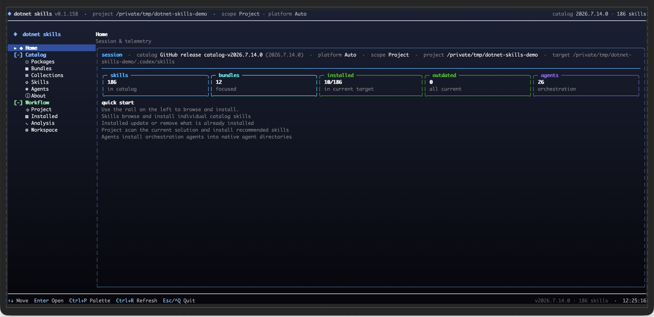
- • It is part of a pack with 30 skills. Install only the ones you need with --skill to keep triggers precise.
- • If two skills overlap, mention the one you want by name.
Questions about Plan UI Change
What does the Plan UI Change skill do?
Plan complex Blazor UI features by decomposing them into focused components. USE FOR: building a complex Blazor page with multiple sections, planning component decomposition, designing a multi-section dashboard or layout, breaking down a large UI feature into composable components, pages with sidebars and content panels, any page with 3+ distinct visual sections or multiple interacting sub-features, identifying paren
How do I install Plan UI Change?
Run "npx skills add managedcode/dotnet-skills --skill plan-ui-change" in your project. The skills CLI installs it for Claude Code, Cursor, Codex and 70+ other agents. In Claude on the web, upload the skill folder as a ZIP under Customize > Skills.
Does Plan UI Change work in Cursor and Codex?
Yes. Plan UI Change uses the open SKILL.md format, so it works in Claude Code, Claude, Cursor, OpenAI Codex, Gemini CLI, GitHub Copilot and other agents that support agent skills.
Is Plan UI Change free?
Plan UI Change is open source on GitHub under the MIT license. It is free to install; check the license before commercial use.
Who made Plan UI Change?
Plan UI Change is published by managedcode in the managedcode/dotnet-skills repository, together with 29 other skills.