plugin87
Install Design Component
Pick your agent. Every command is ready to paste.
npx skills add plugin87/ux-ui-agent-skills --skill design-componentThe open skills CLI detects your agents (Claude Code, Cursor, Codex and 70+ more) and installs to the right folder. Add -g to install globally.
01
Install it
Run the command above, or upload the folder in Claude.
02
Ask naturally
Describe the task. Your agent loads design-component when the request matches its description.
03
Name it if needed
If it does not trigger, say “use the design-component skill”. In Codex, type $design-component.
The skill itself
SKILL.md
Skill: Design Component
Requirements
This skill needs the full UX/UI Agent Skills kit: the gates, the references and
the design-system library. Install it with npx ux-ui-agent-skills@3.1.0 init
or as the Claude Code plugin. npx skills@1.7.6 add copies the skill folder and
nothing else. Installed that way, this skill runs in guidance-only mode: no gate
runs, so it gives no verdict.
Step 0: is the kit here? Check once:
ls ${CLAUDE_SKILL_DIR}/../../../tokens >/dev/null 2>&1 && echo KIT_OK || echo KIT_MISSINGOnKIT_MISSING, open your reply with: "Guidance-only mode: the UX/UI Agent Skills kit is not installed here, so no gate ran and nothing below is measured." Then work from this file and general practice, under three rules. Do not guess or cite the contents of a kit file you could not open. State no measured number (no contrast ratio, no N/N, no "passes WCAG"): write "not verified" where one would go. End with a lineSkipped (kit not installed):that names every gate script this file tells you to run, then the install command above.
Produce a complete component specification matching the project format.
Steps
- Read
${CLAUDE_SKILL_DIR}/../../../.claude/rules/components.md→ "Component Quality Bar" (the 8-state table) and "Atomic Design"; the always-on 8-state table is in${CLAUDE_SKILL_DIR}/../../../CLAUDE.md→ Non-Negotiables. - Check if it already exists:
${CLAUDE_SKILL_DIR}/../../../components/atoms.md,molecules.md,organisms.md,templates.md,navigation.md,feedback.md,forms-advanced.md,overlays.md. Match the existing spec format. - Pull the ARIA pattern from
${CLAUDE_SKILL_DIR}/../../../accessibility/aria-patterns.mdand contrast/target rules from${CLAUDE_SKILL_DIR}/../../../accessibility/wcag-checklist.md. - Map every value to tokens (
${CLAUDE_SKILL_DIR}/../../../tokens/*.json): sizes viasizing.json, states viastates.json. - Apply visual judgment from
${CLAUDE_SKILL_DIR}/../../../taste/design-taste.md(states, focus, no slop). - Optional fast start:
python3 ${CLAUDE_SKILL_DIR}/../../../scripts/scaffold_component.py "<Name>"to emit a stub, then fill it in.
Output
Spec with: anatomy diagram, variants table, sizes table, all 8 applicable states, token mapping, accessibility (role/keyboard/SR), and a note to render via ${CLAUDE_SKILL_DIR}/../../../frameworks/adapter-protocol.md.
Accuracy: verify every state, don't assume (mandatory when code is produced)
A component is only "correct" when every variant × state renders right, not just the resting default. Build a states harness: render the component in each applicable state (default, hover, focus, active, disabled, loading aria-busy, error aria-invalid, selected aria-pressed/aria-selected) × each variant in one HTML file (see ${CLAUDE_SKILL_DIR}/../../../examples/component-states/button.html). Then RUN the gates and report their real output (CLAUDE.md → Verification Protocol):
node ${CLAUDE_SKILL_DIR}/../../../scripts/gate.mjs verify_states.mjs <harness> [--dark]: contrast of every element in default/hover/focusnode ${CLAUDE_SKILL_DIR}/../../../scripts/gate.mjs axe_audit.mjs <harness> [--dark]: ARIA/role/name/label correctnessnode ${CLAUDE_SKILL_DIR}/../../../scripts/gate.mjs measure_render.mjs <harness> [--dark]: every text element AA- overlays/modals also:
node ${CLAUDE_SKILL_DIR}/../../../scripts/gate.mjs verify_focustrap.mjs <harness> --open=<trigger>Every state must pass in light AND dark before the component is "done". Never claim a state is correct without a gate proving it.
Gates prove contrast/a11y. They do NOT prove pixels. RENDER AND LOOK.
The contrast/axe gates pass while the UI is still visibly broken: a checkbox that doesn't toggle, a dash sitting at the bottom of its box, a checkmark and an indeterminate dash with mismatched stroke weight, a control that's too heavy. You must screenshot the harness and inspect it before claiming done, for every state, and after interaction. Playwright + system Chrome:
const b = await chromium.launch({channel:'chrome'});
const p = await b.newPage({deviceScaleFactor:4});
await p.goto('file://'+abs); await p.addStyleTag({content:'*{transition:none!important}'});
await p.mouse.move(2000,2000);                 // park pointer OFF the component
await p.locator('.stack').first().screenshot({path:'/tmp/x.png'});
Read the PNG. Then look for, specifically:
- Functional: click each interactive element and assert the state actually changed (
await loc.click(); expect(await loc.isChecked())). A custom control whose overlay box covers the real<input>will not toggle unless the box haspointer-events:none(or an enclosing<label>forwards the click). - Geometry: glyphs centered, not stacked/offset. If a
display:gridbox holds anopacity:0sibling plus a::after, the pseudo lands in row 2 → usedisplay:noneon the hidden sibling, or one container child. - Stroke consistency: a checkmark and its indeterminate dash must use the same rendering method (one
<svg>, two<path>toggled by state, samestroke-width), never an svg check vs a CSS::afterrect (they read as different weights). - Transition artifact: screenshot WITHOUT disabling transitions and a just-clicked control looks half-faded mid-animation. That is not a bug. Always disable transitions and park the pointer before judging a state.
Consistency across files is non-negotiable. The same component (e.g. checkbox) must use byte-identical CSS + markup in every harness/page. A checkbox that looks thin in form-controls and heavy (native accent-color) in data-table is a bug. Factor one pattern, reuse it verbatim.
Verified custom checkbox/radio pattern (thin, token-driven, gated + eyeballed)
Real <input> underneath (keeps native a11y + keyboard); a drawn .box overlay with pointer-events:none; check + dash as two <path> in one <svg> toggled by :checked / :indeterminate; 1.5px border-strong, .25rem radius, .62rem glyph, stroke-width:2 round caps. Reference: ${CLAUDE_SKILL_DIR}/../../../examples/component-states/form-controls.html and data-table.html (select-all uses indeterminate). Native accent-color renders too heavy. Do not use it when the house look is "thin".
Responsive: every component, no sideways scroll (gated)
Build mobile-first; a fixed-px width that can't shrink is a bug. Run node ${CLAUDE_SKILL_DIR}/../../../scripts/gate.mjs verify_responsive.mjs <file|dir>. It loads each harness at 280/320/414px and fails on any horizontal overflow. The four recurring causes and their fixes:
- fixed
inline-size:Npx→inline-size:100%;max-inline-size:Npx(cap, don't pin). <ul>/<ol>default 40px inline-start padding (a*{margin:0}reset does NOT clear padding) →padding:0;margin:0on every list. This also silently mis-aligns a list's edge vs a sibling block (looks like unequal widths). Same fix.- non-wrapping flex rows (breadcrumb, stepper, tabs) →
flex-wrap:wrap, or for tabsoverflow-x:auto+.tab{flex:none}. grid minmax(Npx,1fr)min larger than viewport →minmax(min(Npx,100%),1fr).
Motion: tokenized, real easing, animate the thing that moves
Timing/easing are tokens (--duration-fast|normal|slow, --ease-out|in|in-out|emphasized in the theme; --transition-micro = fast ease-out). Never hardcode ms/curves. A component that toggles open/closed must animate its height, not just rotate a chevron. Collapse via hidden/display:none alone reads as "rigid, no transition". Smooth-height pattern (no JS measuring): wrap content in an inner that clips overflow, animate the grid track:
.panel{display:grid;grid-template-rows:0fr;transition:grid-template-rows var(--duration-base) var(--ease-spring)}
.panel.open{grid-template-rows:1fr}
.panel > .inner{overflow:hidden;min-block-size:0}
Keep a11y: expand = remove hidden then add .open next frame; collapse = remove .open, set hidden on transitionend. Reference: accordion in ${CLAUDE_SKILL_DIR}/../../../examples/component-states/overlays.html. Always honor @media(prefers-reduced-motion:reduce){…transition:none}.
Layout: fill the space, don't ship AI-empty filler
auto-fit, neverauto-fillfor card grids.auto-fillkeeps empty phantom tracks so 3 cards cluster left with a void on the right;auto-fitcollapses empties so cards stretch to fill the row. Alwaysrepeat(auto-fit,minmax(min(Npx,100%),1fr)).- Equal-height panels in a row:
align-items:stretchon the grid, AND make the shorter panel's body fill:.panel{display:flex;flex-direction:column}+ the inner regionflex:1. A child sized withblock-size:%(e.g. chart bars) needs a definite-height ancestor (aflex:1box or explicit height), or the % resolves to 0 and the element collapses. Wrap the bar in aflex:1.barboxand give the barblock-size:%of that. - A main region that's 80% whitespace reads as machine-generated. Fill a dashboard with real, plausible content (stats row + activity list + a chart), not one lonely widget. Intentional density is the difference between "designed" and "AI slop".
- Trailing gap in a toolbar/header: a flex item with
flex:1capped bymax-inline-sizestops growing and leaves empty space after the last item. Push the right-hand cluster withmargin-inline-start:autoon its first element. - Mobile nav must not overlap. Putting the sidebar and main in the same grid area makes an opened sidebar paint over content. On mobile switch the shell to
display:blockso opening the sidebar pushes main down. Reference:${CLAUDE_SKILL_DIR}/../../../examples/component-states/app-shell.html.
Icons: real lucide, referenced by name (never hand-draw paths)
Hand-approximated SVG path data renders as broken glyphs (a help "?" became a dot; settings became a hamburger). Use verbatim lucide paths, referenced by name via an injected <symbol> sprite: ${CLAUDE_SKILL_DIR}/../../../examples/component-states/icons.js defines each icon once and <svg class="ico" aria-hidden="true"><use href="#i-NAME"/></svg> uses it. No per-use path duplication, no network, offline + gate-safe. Add a new icon to icons.js once; never paste raw paths into markup. (Inline lucide is acceptable only if the path is copied verbatim from lucide.) .ico{stroke:currentColor;fill:none;stroke-width:2}: color via currentColor.
Graphical / icon-only controls (3:1, theme-stable)
A no-text control (carousel dot, kebab, icon button) is held to 3:1 (WCAG 1.4.11), not 4.5. verify_states applies this automatically when an element has no direct text node. Two traps it catches:
- An empty
<button>keeps the UAcolor:buttontext(≈black) regardless of theme → set itscolorto the actual indicator color and drive the visual viacurrentColor(e.g. dot is a::before{background:currentColor}), so the gate measures the real thing. - Theme-flipping tokens (
--color-chart-N,--color-surface-brand) invert between light/dark; white text or a teal indicator on them passes in one mode and fails the other. Use dark-aware values (override in[data-theme="dark"]) or stable tokens (--color-action-primary,--color-text-linkwhich adapts) for avatars, active dots, and selected states.
Tips for Design Component
- • Start a fresh session after installing so your agent picks up the new skill.
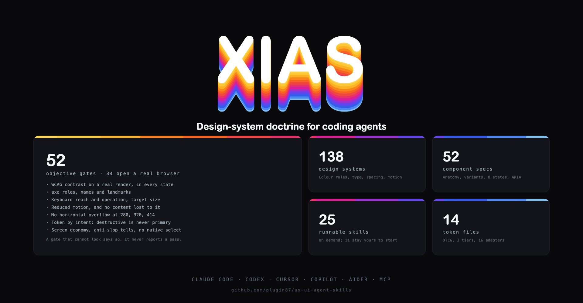
- • It is part of a pack with 26 skills. Install only the ones you need with --skill to keep triggers precise.
- • If two skills overlap, mention the one you want by name.
Questions about Design Component
What does the Design Component skill do?
Design a UI component spec to the house quality bar (anatomy, variants, sizes, the 8 states, token mapping, and accessibility). Use when the user wants to design or document a component (button, input, tabs, toast, combobox, date picker, modal, etc.) at the spec level before or alongside code. For generating framework code, use design-code.
How do I install Design Component?
Run "npx skills add plugin87/ux-ui-agent-skills --skill design-component" in your project. The skills CLI installs it for Claude Code, Cursor, Codex and 70+ other agents. In Claude on the web, upload the skill folder as a ZIP under Customize > Skills.
Does Design Component work in Cursor and Codex?
Yes. Design Component uses the open SKILL.md format, so it works in Claude Code, Claude, Cursor, OpenAI Codex, Gemini CLI, GitHub Copilot and other agents that support agent skills.
Is Design Component free?
Design Component is open source on GitHub under the MIT license. It is free to install; check the license before commercial use.
Who made Design Component?
Design Component is published by plugin87 in the plugin87/ux-ui-agent-skills repository, together with 25 other skills.